User Experience
The world needs better experiences
‹ User Experience
DC's metro machines are in bad shape
Dear the Washington Metro Area Transit Authority,
As a foreign visitor to your city, I found your metro ticket machines quite inscrutable. Normally, I might blame this on my own shortcomings if it weren't for the fact that 1) I am a professional UX designer and 2) I have watched many other people confused by the machines as well. In fact, once I figured the machine out, I was able to help several of my ticket machine neighbors with the process.
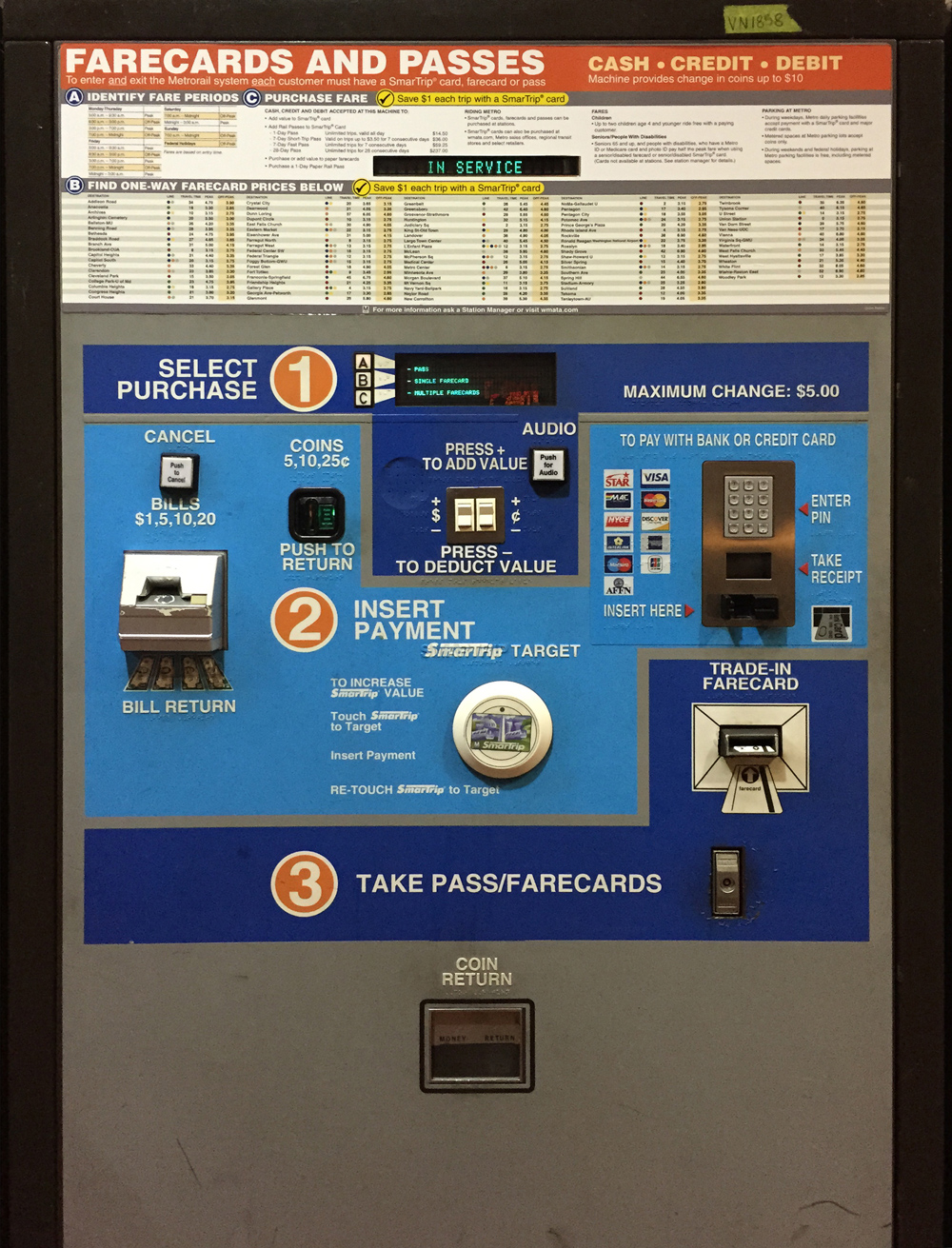
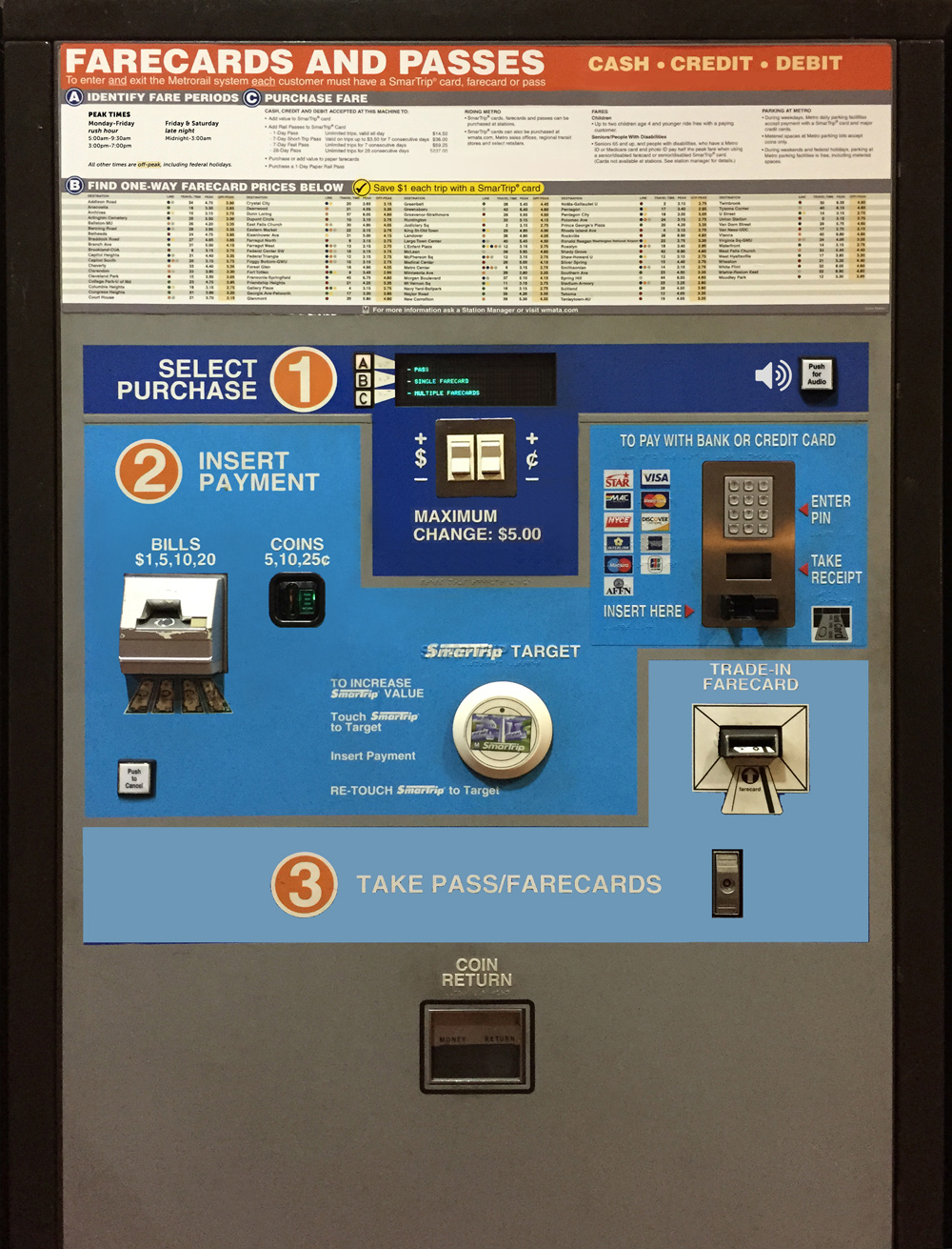
Here is what the machine looks like:
You can tell it needs a lot of help. A big part of the problem is out of scope of this analysis, since it's based on the absurd pay-specific-amounts setup for the DC Metro. This makes everything super confusing.
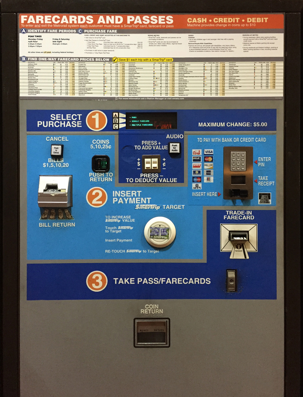
But, if we're stuck with that system, we need to make the machine as easy to use as possible. Take a look at this revision below. First, I got rid of the obvious "in service" notice, since I figured we could use the main screen display to post a message whenever it's NOT in service instead. I also simplified the description of Peak vs. Off-peak at the top left (click on each picture to see them larger.) In addition, I got rid of one of the yellow promotional bars since there were identical bars right on top of each other.
Wait a minute ... does it say, "Machine provides change in coins up to $10"? Well, that's funny ... since below, it says, "Maximum change: $5.00"! I mean, c'mon. Let's go with the lower number and get rid of the sentence at the top.
Ok, now we can get into the meat of it. The main interactive portion of the machine is clearly divided into three steps:
- Step 1: Select purchase - 9 elements
- Step 2: Insert payment (or as I like to call it with a single verb, "Pay") - 20 elements
- Step 3: Take Pass/Farecard - 5 elements
- Plus the coin return.
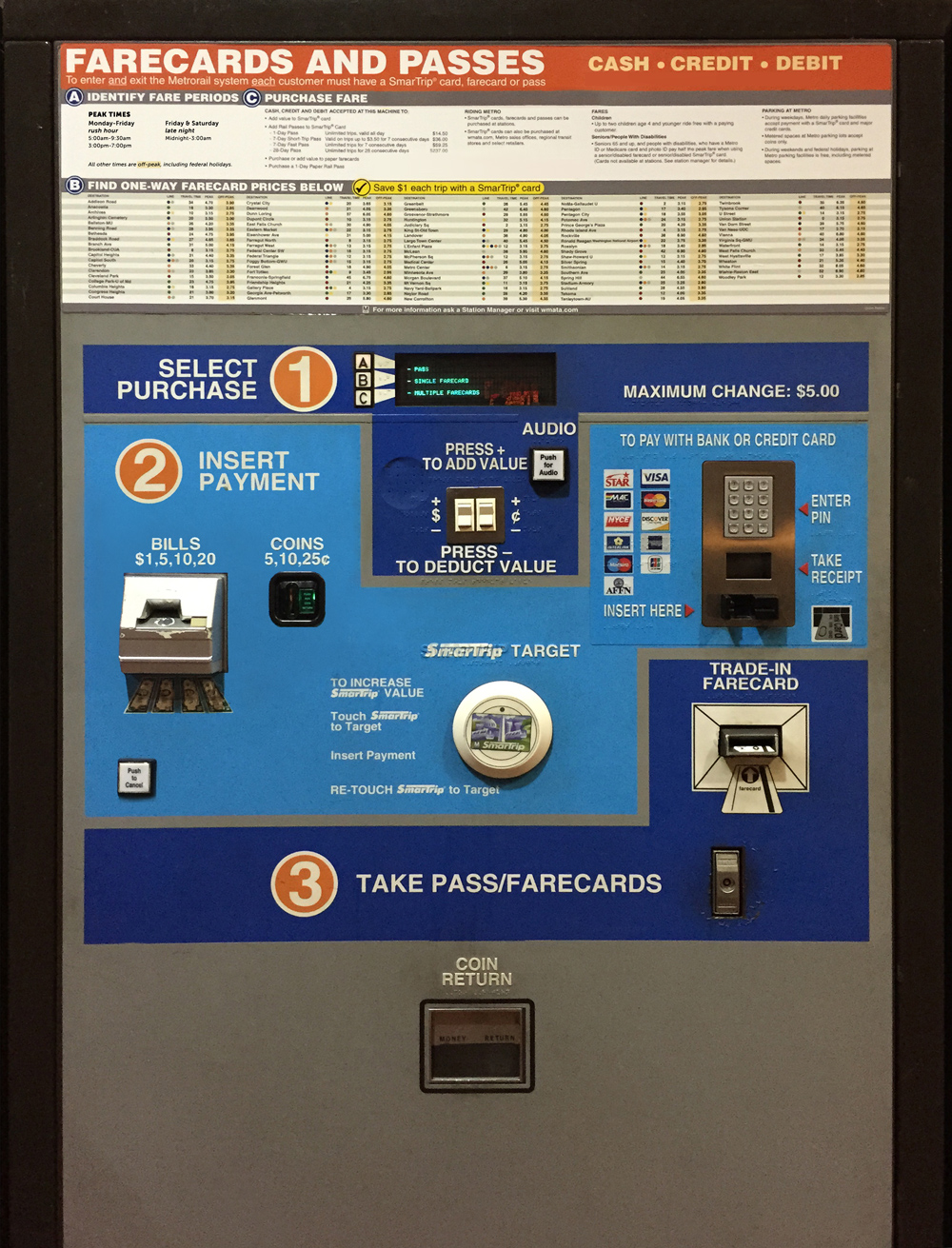
Clearly, the 35 total elements were placed on the machine in as haphazard a way as humanly possible, and then the borders of the three steps were drawn around them. This is what happens when you turn your back on Congress - they'll gerrymander anything they see, including this ticket machine. In reality, a strong possibility is that the engineers building the machine put all the parts wherever was easiest, leaving the designers of the interface to make do with what they were given afterwards. This is not an effective way to design something. Let's start by rearranging some of the pay elements in a more intuitive order.
There was a lot of extraneous text, as well. I removed the "Push to return" label since it's repeated on the button itself. (And obvious to everyone.) The "Bill return" label was also uneccesary; where else would bills be returned? And the "Cancel" label was repeated. While you might think that repeating labels would emphasize them and make them clearer, in reality it just increases the total amount of text, making everything less clear.
(By the way, I've been saving each image here as I go and I can tell the design is getting simpler because the file size is getting slightly smaller each time.)
So, next we'll do the same thing with the "select purchase" section, and get rid of a lot of the redundant text. I also gave the Audio button an audio icon courtesy of Font Awesome. And I made the plus-minus buttons a bit bigger since they were weirdly tiny.
Next, I noticed it was weird that there were two colors for three steps. So, I made three colors instead. It doesn't look super great yet, but I think it will look better when I'm done. Wait and see.
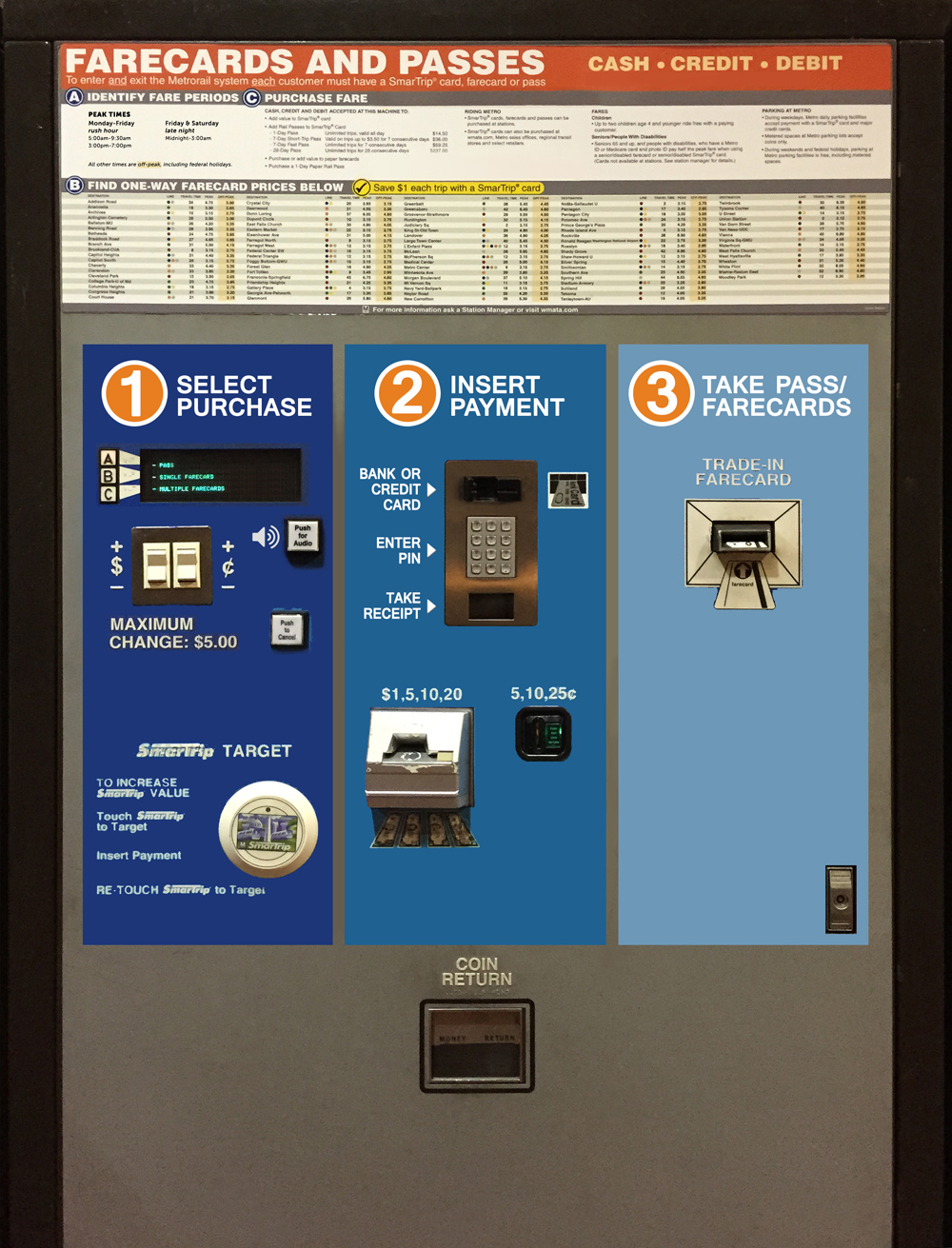
Now for the biggest change. Instead of fitting the three steps into tetris blocks, let's put them in three equal bands. These could either be horizontal or vertical, but I chose vertical.
I also moved the SmarTrip tool over into the first section. I might be mistaken about how it works, but I think it is an alternative choice to the other options.
Ok, now I reset some of the type because all the photoshop manipulation was beginning to make it look pretty grody. Then I got to work on the credit card section. I got rid of all the little card icons, because the gist of it seems to be that the machine accepts ALL cards. I mean, it includes Visa, MasterCard, Discover, American Express, and ... a MAC card? I haven't seen that logo in years. I also think that showing all the cards like this could mistakenly lead someone to believe that it DOESN'T accept their ATM card, since it's not shown. Very misleading. If the machine accepts the vast majority of cards, then there's no harm in just letting someone try their card to see if it works. You'd need an error state calling out the ones that don't work, but you need that anyway (hopefully it has one already).
I also realized I probably made a mistake with the audio ... I thought it was an option for the ENTIRE process, but I think now it's just for the first screen. So I moved it back there. But this is just a guess.
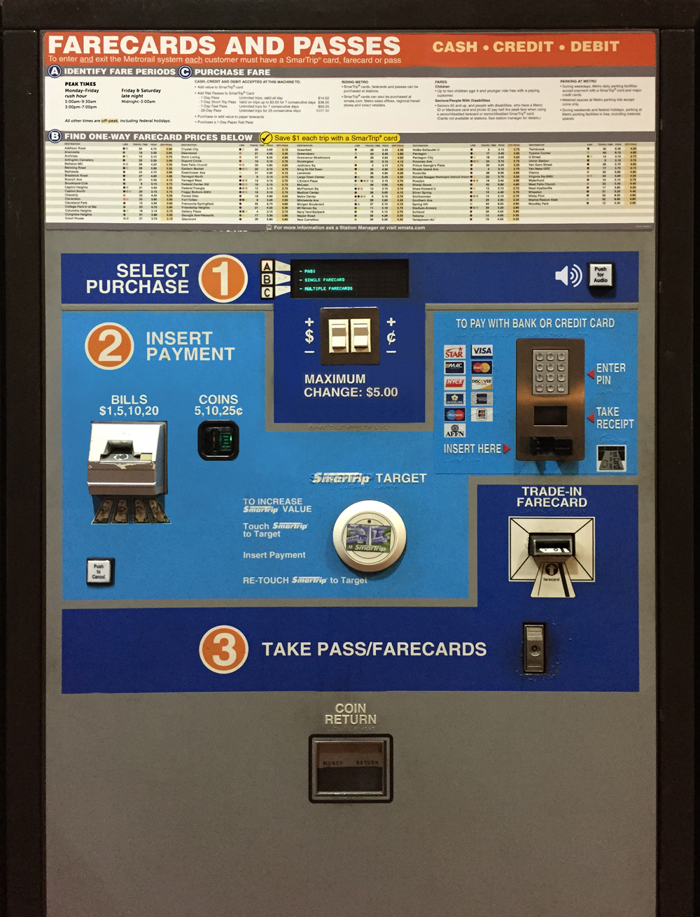
Now I just started tweaking everything else I can see. A button, for example, does not need the helpful text "push". It can just say what it does. And the three buttons at the top don't need to be "A, B, C" if those letters are never referred to. I also changed everything to sentence case (Just look at the amazing combination of cases in the SmarTrip area previously.)
Now for one final touch: moving the coin return up to where it belongs in the payment section. Note: I had to eliminate the braile while I was moving everything around, but assume it would of course still be there.
And there you have it, a much easier to use Metro ticket machine, side by side with the original. Of course, to REALLY improve it, we would do rounds of user testing on the new model (to match the ad-hoc user testing that myself and my fellow passengers experienced on the original), and keep iterating. Best of luck.
Sincerely,
Jesse Richards
‹ User Experience
