Select Bus Service needs a new kiosk
Dear the MTA,
We were really excited when the new NYC Select buses started running next to us on First Avenue a few years ago. The whole system is beautifully designed - there are dedicated bus lanes, totally redesigned buses (shorter and with more entrances for faster loading), and a new payment system in which you pay before you board. All designed to speed up the buses - and it totally works. I can walk out our door and grab a bus within a minute or two at any time of day and it will zoom uptown (or downtown on Second Avenue.)
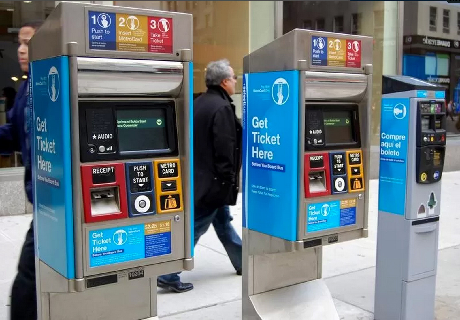
In fact, the only design flaw I've found is in the ticket machines themselves - and boy, are they a doozy. Take a look:

The top infographic explains that there are 3 steps, which seems easy enough. But then why are they in the wrong order where you actually have to do them below? I brought this photo into Photoshop to see if I couldn't improve upon the design a bit:

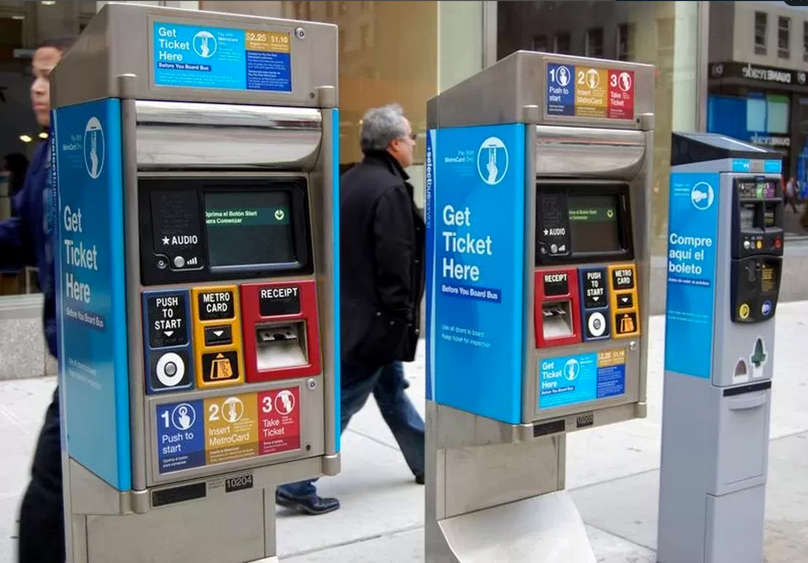
You can see I reordered the actions so that they match the infographic. And then I moved the infographic so it's right next to the actions and you don't have to look in two separate places.
But now it's easier to see that there's a lot of redundant information. Can we condense it?

Here I've merged the infographic with the actions themselves, so that the steps aren't repeated. Much simpler. Since we now had extra space to kill at the top of the machine, I added a huge headline emphasizing the main critical piece of information any newcomer needs: that you need to buy the ticket BEFORE you board the bus.
In a perfect world, I would get rid of Step 1 (the start button) as well, and make the machine activate just by inserting your metrocard. But I'm going to assume that's a technical limitation.
I think you could even get rid of the huge monitor display, since it's not really needed. The only time it has to say anything important is if you have insufficient fare, I guess, and a smaller marquee could say that. Having a big monitor implies that that's the interface (as in the MTA's subway machines), but it's not, which is unnecessarily confusing.
And what's with the smaller machine on the right? Is that the Spanish-speaking one? What, they can't fit three sentences of Spanish on the other machines?
Here's hoping that whenever the time comes to add more machines or cycle these out, you can hire a UX designer or two and improve these. Then I won't have to help as many tourists.
Sincerely,
Jesse Richards
Response
This is in response to your recent e-mail suggesting improvements to the Select Bus Kiosks.
MTA New York City Transit and the MTA Bus Company are committed to providing safe, courteous, reliable, and accessible bus service. We forwarded a copy of your suggestion to our planning personal for possible future consideration.
Thank you for using our online system.
Osvaldo Cruz
Associate Staff Analyst